Using Color Theory to Make Your Event Pop


When it comes to event planning, one of the major elements that often gets neglected is the issue of color: how do you create a color scheme around your event marketing and for the event itself that will communicate all the right things about the event (and, if you’re representing an organization, the brand)?
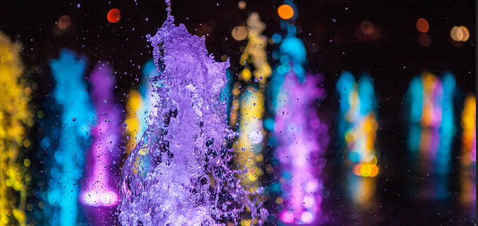
Image Credit: Terry Robinson
Color theory can provide some useful insights as you’re planning your event aesthetic. If you’ve never heard of it, basically color theory is the whole world of psychological, physiological and creative design research that has determined how we perceive different colors and different combinations of colors. This ranges from understanding what sort of mental associations we have with certain colors (for example, red = passion), as well as how pleasurable it is to see certain combinations of colors together (remember the color wheel?). Chances are, color theory contributed to the design of your company logo and website, and it may even be something you informally consider all the time.
To help bring together some of the key ideas from symbolic color theory, here’s our breakdown for each of the most commonly used colors and how they can be used to leave a big impression. Don’t forget, this is useful not only for the event itself, but for marketing materials you use for publicity as well.
For more information on complementary colors—for example, help in choosing colors that will work well with your logo or existing branding—check out this post on color harmonies.
GREEN
The classic color of rebirth, renewal, and freshness, green is a great color to use for events in the Spring and events with an environmental theme. Green is also a color denoting luck (four leaf clovers and St. Patrick’s Day), and money, so it works well for those themes also.
Green is the easiest color for the eye to process, so it can be used as an unobtrusive background color and a calm color, great for events with a relaxed ambience or nature theme.
YELLOW

Yellow is associated with energy, intensity, and intellect. Used sparingly, yellow can add a splash of interest to marketing in darker or calmer colors. Yellow makes sense for high-energy events such as athletic events, hackathons, etc.
ORANGE
Orange can denote strength, enthusiasm, fascination, creativity, and success. Not a behind-the-scenes color, orange takes center stage, and makes sense as an accent color amid other cooler colors. Orange works well for modern art events, networking events, and other events with an upbeat and highly social ambience.
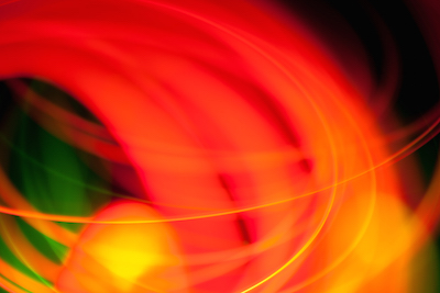
RED
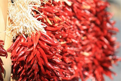
Red is, of course, the color of passion, and also danger, intensity, power and desire. Typically used for romantically-themed events (such as Valentine’s Day), red also works well as an accent color for events with a power or danger theme.
PINK
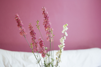
Pink is associated with traditional femininity, softness, harmony, and calm. It’s often used in these contexts, and also often used (and understood) ironically—especially the darker varieties. Pink has come to be associated with breast cancer awareness.
Pink works well for traditionally “girly” or “ladylike” events—either ironically or unironically—as well as events themed towards women or girls, although this can come across as too traditional in many cases. Pink suits events with a cultured or civilized ambience.
VIOLET
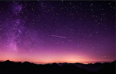
Purple is the color of royalty, regality, wisdom, spirituality, mysticism, courage, and opulence. A deep and thoughtful color, purple makes sense for winter events, events with a mystical or magical theme, events held in opulent surroundings, and events honoring important and respected persons.
BLUE

Blue is the most commonly used color in logos and branding, and it’s also the most common “favorite color”. Traditionally it denotes trust, loyalty, confidence, intelligence, ideas, heaven, tranquility, wisdom, creativity—quite a broad list of associations! For that reason, blue is one color that can be used in almost any context.
BLACK
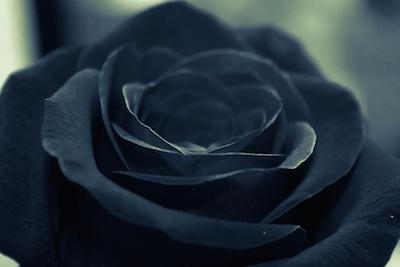
Black is the color of sophistication, power, elegance, formality, and mystery. A bold choice for a color scheme, black makes sense for formal (evening) events, avant-garde events, and events with a darker theme (such as Halloween).
WHITE
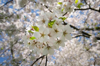
White denotes purity and cleanliness, as well as modernity. It’s another bold choice, and after the classic use at weddings, it works best for formal (day) events, avant-garde events, and events with a theme related to purity or youth.
Have an interesting point of color theory you’d like to share? Leave it in comments below or tweet it to us!


Qhaaf Bedding is a leading bed sheet brand in Pakistan, offering a diverse range of luxurious bedding sets to elevate the comfort of your sleep. With a strong reputation for quality and design, they are among the top bed sheet brands in Pakistan, providing the perfect blend of style and coziness in their bed sheets.
Elevate your style quotient this Eid with Panache Apparel’s much-awaited Eid collection 2023, featuring intricately crafted outfits showcasing the brand’s signature Panache and attention to detail.
Mannat Clothing’s Pakistani pret wear reflects the region’s rich cultural heritage. With an easy-to-use online store, Mannat Clothing is the perfect destination for party wear dresses online.
Aspire Bedding offers an exceptional range of bed spreads that can add a perfect final touch to your bed. Aspire’s bed spread comes in different colors and patterns, which can perfectly complement any decor style.
Thanks for sharing very good information. Your blog has some really cool information. you read the post about 먹튀검증 Impressed. I’ll bookmark your blog and come back for the next article.
Your article is a perfect article without a hitch. Thank you. My site: okbet online casino
Chinyere is an online shopping store that gives you new designs of winter dresses for women. Chinyere helps you to get the perfect winter outfits for women online. Chinyere gives you the best and latest collection of women’s clothes online.
Etisal is a leading retailer in Pakistan that provides the latest trouser designs to keep you looking sharp. Etisal has a team of experienced designers who create new trouser designs that are both stylish and comfortable.
Color theory is a subject that most designers and marketers are familiar with. Color is significant because it influences the overall effect of branding and advertising. Color is used by consumers’ brains to identify items and the companies that create them.
echten-fuhrerschein-kaufen.
Comprare Patente di Guida
Color theory is a subject that most designers and marketers are familiar with. Color is significant because it influences the overall effect of branding and advertising. Color is used by consumers’ brains to identify items and the companies that create them.
Thank you for publishing good content
Để sử dụng các màu mạnh thì thật là khó. Tuy nhiên điều đó luôn mang đến những điều tuyệt vời
Full Color is beautiful, That’s great!!
It Is One Of The Best Simple Mode Online Video Game Get Robux Free I Hope You Like And Happy For This Game.