10 Color Palettes for a Summer Soiree


Picking a strong color scheme for an event is one of those event planning challenges that is frequently underrated in its importance. Even if you’re planning a company-focused event, eventually people just get sick of seeing the same brand colors over and over.
As you launch into your summer events for the year, here are a few ideas for fresh color palettes that will help make your event pop. And don’t forget to be consistent: use the same scheme for the event, for the invitations, and even the website. A great color scheme not only contributes majorly to the ambience of an event, it also has visual impact when you want to share event photos and videos afterward.
Here are 10 summer event color palettes for the season!
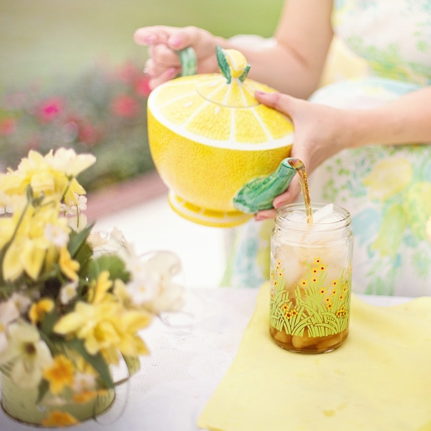
Wildflowers & Tea
The ultimate color scheme for a civilized tea party, play up golden yellows, pastel blues and pinks, and grassy greens for an event that evokes the gifts of summer.
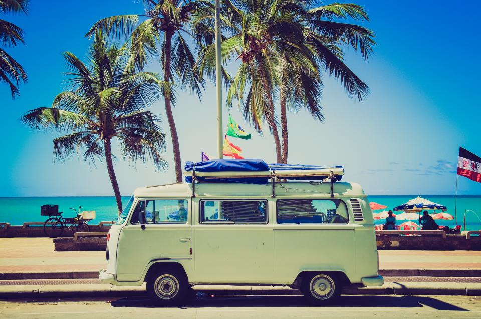
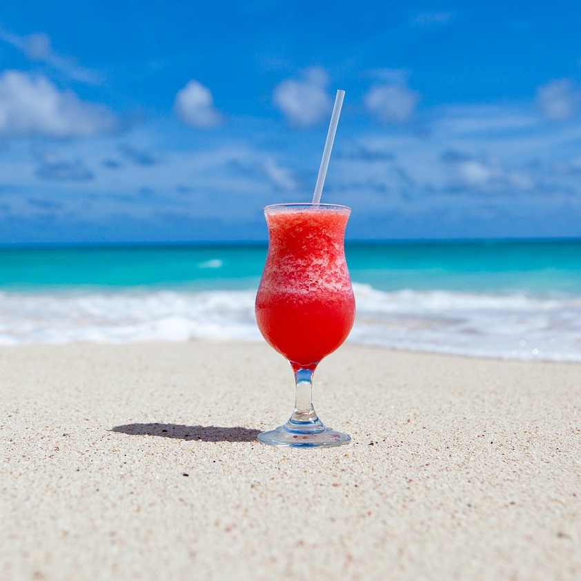
Beach Classy
Take your classic style to the beach with sandy neutrals mixed with a splash of eye-catching red. This works especially well for evening parties.
Rustic Chic
Take advantage of the DIY-ability of the shabby chic/rustic chic movement! Mix naturals (found in materials like jute, twine, natural linen) with woody browns to get a warm and inviting rustic feel.
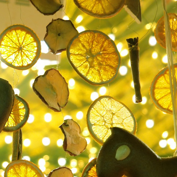
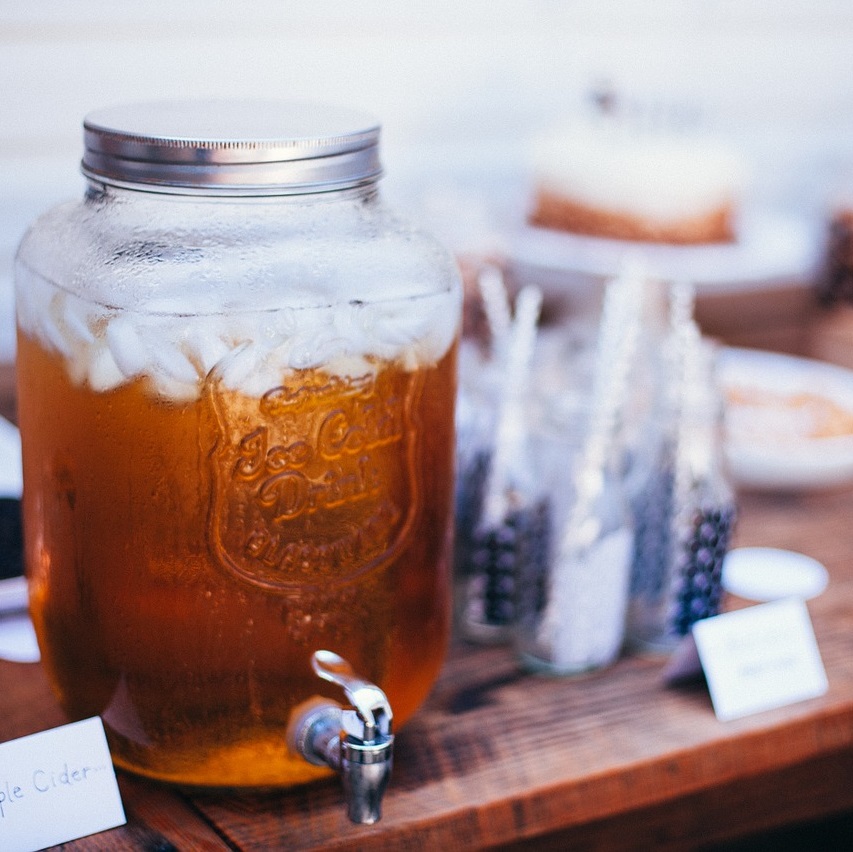
Lemons & Limes
Bright yellows and yellow-greens are an energizing pairing that suit evening and day events to a T. Best for up-tempo events.
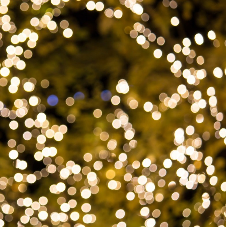
Gatsby
Want the magic of the Gatsby era at your evening outdoor celebration? Opt for white-natural backdrops (for example, a flowing tent) with warm-white or gold string lights, and minor accents of deep gold and deep red jeweled décor.
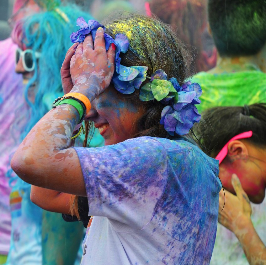
Festival
To get the festival feel at your event, combine neon pinks, greens, blues and yellows (for example, hanging streamers) with a bit of plain old white and bohemian lace. Especially fitting for events held outside in a grassy space.
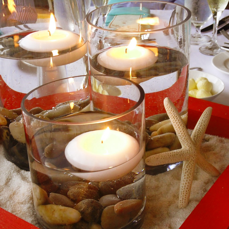
Sex on the Beach
Another beachy classic, a palette of soft teal, pale or bright blue, orangey-red and sandy naturals can make a great backdrop for an outdoor soiree. Teal and red hanging lanterns just might seal the deal.
Island Time
Island colors of deep orange and rich greens work well with plain white to provide a chilled-out, I’m-on-vacation ambience. Atmospheric in the day or night.

Yacht Rock
To make your guests feel like they’re partying on a boat—even if they’re not—go for a high-contrast palette of navy blue, clean white and deep gold. Mix with rope and jute accents to get more of that “nautical” feel.
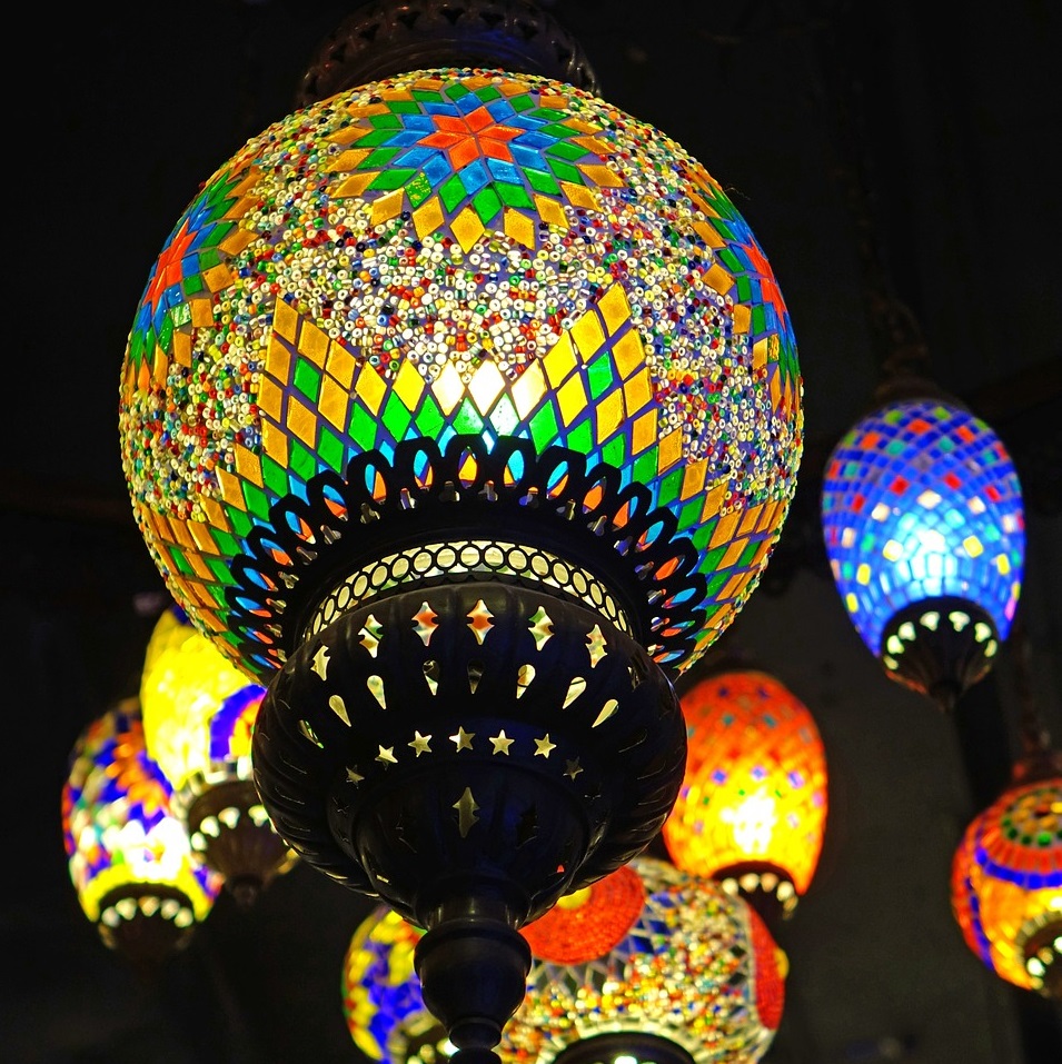
Marrakech Express
Morroccan colors are extra-saturated due to the extreme importance of gorgeous lamps and lanterns. Go for deep reds, purples, teals, metallic gold and brass. Lanterns and warm-white string lights (twinkly, not globes) can also bring a bit of the casbah into your venue.
Is there a color palette you’re loving that we missed? Leave it in comments below or tweet it to us!


We all want luxury Frances dupes in affordable price range. Aroma360 Coupons code is providing the best fragrances for you and diffusers for your home to smell fresh every time.
Don’t plan your travel without Safar ki dua. This will really help you.
how to find ip address for hp printer :- Your printer’s almost all printer’s can print out a community configuration page, which suggests the printer’s ip deal with. Test your printer’s manual for precise commands, but normally, you can try this via your printer’s settings, or with the aid of lengthy-urgent a sure button.
FÜHRERSCHEIN ONLINE KAUFEN
It was an interesting article, thank you
I like Gatsby
helpful information
Nike even has produced new brands of shoes specifically designed for the hip hop music videos which have been as a form of product placement.
With the slowed economy starting to come back around, many analysts
say that people are almost Nike Shox Deliver
ready to spend money on luxuries once again. “Look dude I’m tired of hearing all this crap about what we going to do to V Layne when they come up here.
Thank you a lot for giving everyone a very marvellous opportunity to read articles and blog posts from this blog. It is always so kind plus jam-packed with a good time for me personally and my office friends to visit your blog at least thrice weekly to read through the latest stuff you have got. And of course, I am just always happy concerning the cool principles you give. Some 2 ideas in this posting are basically the most efficient we have ever had.
I enjoy you because of your own hard work on this web site. My niece takes pleasure in going through internet research and it is easy to see why. We know all relating to the lively form you produce practical tricks via this website and encourage participation from other ones about this idea and our daughter is truly becoming educated a great deal. Take pleasure in the rest of the new year. Your conducting a first class job.